AI Color Palette Generators: How Machine Learning Tools Compare to Traditional Color Theory
Choosing the right color palette can make or break a design project. The difference between a website that feels polished and professional and one that looks amateurish often comes down to color choices — yet color selection remains one of the most subjective and time-consuming parts of the design process. In 2026, AI color palette generators have matured from simple algorithmic tools that produce random harmonious combinations into intelligent systems that understand brand context, accessibility requirements, cultural color associations, and current design trends.
After testing a dozen AI-powered color tools across web design, UI/UX projects, and brand identity work, I’ve found that the technology has reached a point where it consistently produces better starting palettes than most human designers create from scratch. The key word there is “starting” — these tools excel at generating a strong foundation, but the best results still come from designers who understand how to refine and adapt AI-generated palettes for their specific use case.
This article evaluates the top AI color palette generators, compares their approaches and output quality, and provides practical frameworks for integrating AI color tools into your design workflow.
How AI Color Palette Generators Actually Work
Understanding the technology behind these tools helps set realistic expectations. Most AI color generators use one of three approaches, and knowing which approach a tool uses tells you a lot about what kind of output to expect.
Color space clustering: Tools like Khroma and Colormind analyze large datasets of existing designs and use machine learning to identify statistically common color combinations. The AI learns patterns like “dark blue backgrounds frequently pair with white text and orange accents” from thousands of real-world examples. This approach produces palettes that feel familiar and proven because they’re derived from designs that already work.
Generative models: More advanced tools use generative adversarial networks (GANs) or diffusion models to create novel color combinations. These systems don’t just replicate existing patterns — they can generate unexpected pairings that still maintain visual harmony. The trade-off is higher variability; some generated palettes are brilliant, others are unusable.
Constraint-based optimization: Tools like Adobe Color’s AI features work within specific constraints — brand colors, accessibility contrast ratios, cultural associations — and optimize the palette within those boundaries. This is the most practical approach for professional work, where you need a palette that meets specific business requirements rather than just looking nice.
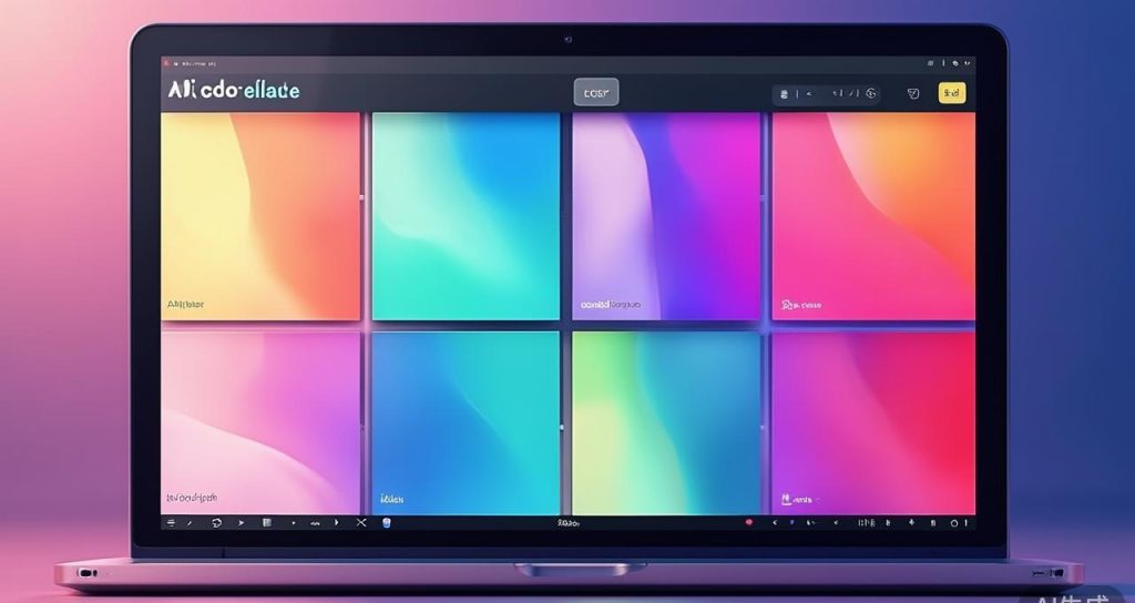
Top AI Color Palette Generators in 2026
Khroma — Personalized Color Discovery
Khroma takes a unique approach: it trains a neural network on your personal color preferences. When you first use the tool, you’re shown a series of color combinations and asked to like or dislike each one. After training on 50-100 selections, Khroma’s algorithm develops a model of your aesthetic preferences and generates palettes tailored to your taste.
The personalization is genuinely effective. After my initial training session, Khroma consistently produced palettes I would have chosen myself — but with combinations I hadn’t considered. It’s particularly good at identifying subtle color relationships that align with your preferences, like suggesting a slightly warmer neutral than you’d normally pick, or introducing a complementary accent color you wouldn’t have thought to include.
Strengths: Highly personalized output, generates palettes, typography, and gradient combinations, unlimited free generation after training.
Limitations: Requires upfront training investment (15-20 minutes), palette quality depends on how carefully you train it, no brand color input, limited export options.
Colormind — Dataset-Driven Palette Generation
Colormind sources its intelligence from real-world datasets — photographs, movie stills, popular designs, and artwork. You can generate palettes from scratch or give it a base color and let the AI build a complete palette around it. The tool also offers specific dataset modes including “movie,” “art,” and “pop” for different aesthetic directions.
In testing, Colormind’s movie and art datasets produced the most distinctive palettes — colors pulled from Wes Anderson films or Renaissance paintings that you’d never arrive at through traditional color theory alone. The “generate from image” feature is particularly useful: upload any photograph and Colormind extracts a cohesive five-color palette that captures the image’s mood.
Strengths: Diverse dataset-driven output, image-to-palette extraction, base color locking, completely free with no account required.
Limitations: Interface is minimal and dated, no accessibility checking, no brand color constraints, occasionally produces clashing combinations from datasets.
Adobe Color (with AI Explore) — Professional Design Integration
Adobe Color has been a standard tool for years, and its AI-powered “Explore” feature represents the most production-ready AI color generation available. The AI suggests palettes based on color harmony rules, trending combinations, and community favorites. What sets it apart is deep integration with Adobe’s Creative Cloud ecosystem — generated palettes sync directly to Photoshop, Illustrator, and XD.
The AI Explore feature analyzes the relationship between your selected colors and suggests complementary, analogous, triadic, and split-complementary extensions. It also evaluates contrast ratios for accessibility compliance (WCAG 2.1), which is increasingly important for professional web design where accessibility isn’t optional.
Strengths: Professional-grade accessibility checking, Creative Cloud integration, community library of millions of palettes, multiple harmony rule modes.
Limitations: Requires Adobe account, AI suggestions can feel conservative compared to dedicated tools, free tier has limited features compared to Creative Cloud subscription.
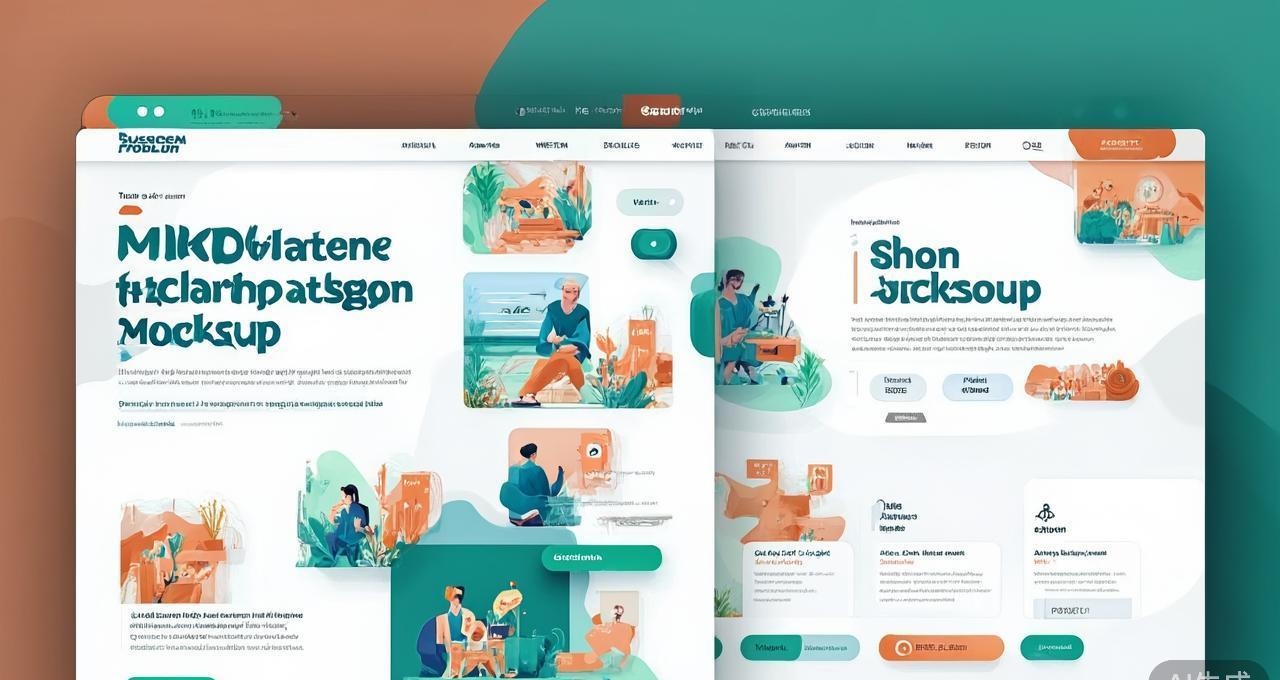
Musho AI — Figma Plugin with AI Palette Generation
Musho AI operates as a Figma plugin, generating complete UI designs including color palettes from text descriptions. While it’s more than just a color tool, its palette generation is impressive — it considers the design’s purpose (SaaS dashboard, e-commerce store, portfolio site) and generates contextually appropriate color schemes.
The palettes Musho generates tend to be more practical and implementation-ready than standalone color tools. Because it’s designing within the context of a full UI, the colors are already tested against realistic component backgrounds, text sizes, and interaction states. The downside is that palette customization is limited — you get what the AI generates, with only basic hue adjustment controls.
Strengths: Context-aware palettes designed for real UIs, Figma integration, generates complete design systems, fast iteration.
Limitations: Figma-only (not standalone), limited palette customization, requires subscription for unlimited use, output quality varies with prompt specificity.
Feature Comparison
| Feature | Khroma | Colormind | Adobe Color | Musho AI |
|---|---|---|---|---|
| AI Approach | Personal preference learning | Dataset analysis | Harmony rules + community | Context-aware generation |
| Accessibility Checking | No | No | Yes (WCAG 2.1) | Basic |
| Brand Color Input | No | Yes (base color) | Yes | Yes (via prompt) |
| Image-to-Palette | No | Yes | Yes | No |
| Design Integration | None | None | Adobe CC | Figma |
| Price | Free | Free | Free / CC subscription | From $9/mo |
| Palette Export | CSS, URL | URL, array | CSS, SCSS, XML, ASE | Figma styles |
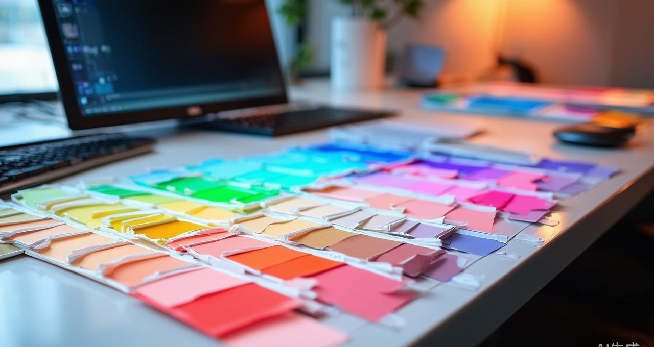
Palette Quality Comparison
I tested all four tools by requesting palettes for five real-world scenarios: a fintech startup website, a wellness blog, an e-commerce fashion store, a SaaS dashboard, and a photographer’s portfolio. Each palette was evaluated on harmony, distinctiveness, brand-appropriateness, and usability (contrast, readability).
| Scenario | Khroma | Colormind | Adobe Color | Musho AI |
|---|---|---|---|---|
| Fintech startup | 7/10 | 6/10 | 9/10 | 8/10 |
| Wellness blog | 8/10 | 7/10 | 8/10 | 7/10 |
| Fashion e-commerce | 6/10 | 9/10 | 7/10 | 8/10 |
| SaaS dashboard | 5/10 | 5/10 | 8/10 | 9/10 |
| Photographer portfolio | 8/10 | 9/10 | 7/10 | 6/10 |
Adobe Color and Musho AI performed best for professional/ commercial projects where accessibility and brand consistency matter. Khroma and Colormind excelled for creative and artistic projects where visual distinctiveness is the priority over strict usability requirements.
AI Color Theory vs Traditional Color Theory
Traditional color theory relies on the color wheel and mathematical relationships between hues — complementary (opposite), analogous (adjacent), triadic (equidistant), and so on. These rules produce reliably harmonious palettes but tend toward predictable results. After seeing hundreds of complementary blue-orange and analogous green-teal palettes, many designers find traditional approaches feel formulaic.
AI color tools have several advantages over traditional theory:
- Pattern recognition at scale: AI trained on millions of designs identifies color relationships that traditional theory doesn’t describe — like the specific muted earth tones that work for artisanal food brands, or the high-contrast neon pairings popular in streetwear design.
- Contextual understanding: AI can generate palettes appropriate for specific industries, moods, or cultural contexts — something a color wheel can’t do. A palette for a Japanese restaurant has different color associations than one for a Mexican restaurant, and AI tools capture these nuances.
- Accessibility-first generation: AI can simultaneously optimize for visual harmony and WCAG contrast requirements, ensuring your palette is both beautiful and usable. Manual accessibility checking after the fact often leads to awkward compromises.
However, traditional color theory retains important advantages:
- Predictability: Traditional rules produce consistent results every time. AI tools can generate wildly different palettes from the same input, which is either a feature (creativity) or a bug (inconsistency) depending on your needs.
- Communication: “Use a complementary color scheme” is a clear, unambiguous design direction that team members understand. “Use an AI-generated palette” communicates nothing about the underlying design logic.
- Fundamentals: Understanding why colors work together (hue relationships, value contrast, saturation balance) makes you a better designer regardless of what tools you use. AI tools that skip the “why” risk producing designers who can generate palettes but can’t evaluate or refine them.
Practical Workflow: Integrating AI Color Tools
The most effective approach I’ve found combines AI generation with traditional evaluation. Here’s the workflow that produced the best results in my testing:
Step 1 — Define constraints first: Before touching any AI tool, establish your palette requirements: brand colors that must be included, accessibility contrast ratios needed, industry conventions to follow or break, and any cultural color associations relevant to your audience.
Step 2 — Generate broadly: Use 2-3 different AI tools to generate 10-15 palette candidates each. Different algorithms produce meaningfully different results, and the best palette often comes from a tool you didn’t expect.
Step 3 — Evaluate systematically: Score each candidate palette against your constraints. Check contrast ratios using a tool like WebAIM’s contrast checker. Test palettes in context by applying them to actual UI mockups, not just swatch views.
Step 4 — Refine manually: The best AI-generated palettes rarely need zero adjustment. Tweak individual hue, saturation, or lightness values to perfect the result. This manual refinement step is where traditional color theory knowledge becomes invaluable.
For designers looking to improve their overall AI tool workflow, check out our comparison of AI image and design tools and our guide to AI-powered creative platforms.
Pros and Cons Summary
Khroma
- Pros: Deeply personalized results, free unlimited use, generates palettes and typography combos, no account needed
- Cons: Requires 15-20 min training, quality depends on training effort, no accessibility features, no design tool integration
Colormind
- Pros: Diverse creative palettes, image-to-palette extraction, completely free, no account, fast generation
- Cons: Minimal interface, no accessibility checking, occasionally produces unusable combinations, limited customization
Adobe Color
- Pros: WCAG accessibility compliance, Creative Cloud integration, massive community library, multiple harmony modes, professional-grade
- Cons: Conservative AI suggestions, requires Adobe account, best features locked behind CC subscription
Musho AI
- Pros: Context-aware palettes for real UIs, Figma integration, generates complete design systems, fast iteration cycle
- Cons: Figma-only, limited palette customization, subscription cost, quality varies with prompt specificity
Color Accessibility and AI
Accessibility isn’t an afterthought — it’s a legal requirement in many jurisdictions and a core quality metric for professional design. According to the Web Content Accessibility Guidelines (WCAG) 2.1, normal text must have a contrast ratio of at least 4.5:1 against its background, and large text (18px+ or 14px+ bold) must have a ratio of at least 3:1.
Of the tools tested, only Adobe Color provides built-in WCAG contrast checking during palette generation. For the others, you’ll need to verify accessibility separately using tools like WebAIM’s Contrast Checker or the Stark plugin for Figma. This is a significant workflow consideration — if accessibility compliance is a project requirement (and it should be), Adobe Color’s integrated checking saves substantial time.
AI tools are beginning to address accessibility more directly. Adobe’s AI now generates palettes that meet contrast requirements by default, and newer tools are incorporating accessibility constraints into their generation algorithms. Expect this to become a standard feature across all AI color tools within the next year.
Frequently Asked Questions
Are AI color palettes better than traditional color theory?
They’re different, not strictly better. AI excels at generating diverse, contextually appropriate palettes quickly and at incorporating accessibility constraints. Traditional color theory provides the foundational understanding needed to evaluate and refine AI-generated palettes. The best results come from combining both approaches — using AI for rapid generation and traditional theory for evaluation and refinement.
Can AI color palette generators ensure accessibility compliance?
Only Adobe Color currently provides built-in WCAG contrast checking during generation. For other tools, you must verify accessibility separately. Some AI tools are beginning to incorporate accessibility as a generation constraint, but this is still emerging. Always test your final palette against WCAG 2.1 contrast requirements regardless of what tool generated it.
How do I use AI-generated color palettes in my website?
Most tools provide CSS variables or hex codes that you can directly apply to your stylesheet. For WordPress sites, many themes support custom color palettes through the Customizer or theme settings. Export your palette as CSS custom properties for maximum flexibility — this lets you update colors site-wide from a single location. For a more integrated approach, use a Figma plugin like Musho AI to generate palettes directly within your design mockups before implementation.
What’s the difference between AI color tools and traditional palette generators like Coolors?
Traditional generators like Coolors use algorithmic color harmony rules (complementary, analogous, triadic) to create palettes. AI tools go further by learning from real-world design datasets, understanding context (industry, mood, audience), and personalizing output based on user preferences. Traditional tools are more predictable and faster for simple needs; AI tools produce more sophisticated, contextually appropriate results but with less consistency.
Can AI color tools work with existing brand colors?
Yes, most AI tools allow you to input one or more base colors and generate harmonious extensions. Adobe Color’s “Extract from Image” and Colormind’s base color locking both work well for brand-consistent generation. The AI builds a complete palette around your existing brand colors while maintaining visual harmony.
How many colors should an AI-generated palette include?
For most web projects, a palette of 5-7 colors is sufficient: one primary, one secondary, one accent, one neutral dark, one neutral light, plus optional success/warning/error states. AI tools typically generate 5-color palettes by default, which is a good starting point. You can always extend a palette by asking the AI for lighter or darker variations of specific colors.
Final Verdict
The best AI color palette generator depends on your workflow and requirements. For professional web and UI design where accessibility compliance matters, Adobe Color is the clear winner — its WCAG integration and Creative Cloud ecosystem make it the most practical choice for production work. For creative exploration and unique palette discovery, Colormind and Khroma produce the most visually distinctive results, with Khroma offering the advantage of personalization over time. For designers working in Figma, Musho AI provides the most seamless integration, generating palettes within the context of actual UI components.
Whatever tool you choose, remember that AI-generated palettes are starting points, not final answers. The designers who get the best results from these tools are the ones who understand color theory well enough to evaluate, refine, and adapt AI suggestions for their specific context. AI accelerates the palette creation process dramatically — but the human judgment that separates good color choices from great ones remains irreplaceable.
Disclosure: This article was generated using AI tools and reviewed by our editorial team for accuracy and quality.
- Real-time Transcription for Google Meet - This system allows real-time transcripti
- Servant AI - All-in-one AI secretary with 200+ no-sig
- ElevenReader - ElevenReader is an app that reads text a
- ViggleAI - AI animation tool and image-to-video gen